EViews
EViews documents (also known as “workfiles”) are files that hold different objects (which contain data). Unlike Microsoft Word or Excel, EViews does not open up a blank document upon launch. Instead, the user must always specify the structure (or frequency) of the file, a range for the data, and a sample. A workfile is made up of one or more page files.
EViews allows the user to create an empty workfile (i.e., one without any data) and to create a workfile by importing data from another program.
There are three types of workfile structures available in EViews:
-
Dated/regular frequency (for time series data)
-
Unstructured/undated (mostly for cross-sectional data)
-
Balanced panel (for panel data).
A workfile can have multiple pagefiles, each of a specific (possibly different) type. However, series objects in a specific pagefile must have the same structure (frequency).
Creating a workfile for annual time series data involves 4 steps: (1) specifying the workfile structure as “dated – regular frequency”, (2) specifying the frequency of data as annual, (3) selecting a start and end date, and (4) naming your workfile. The 4th step is optional.
After creating a workfile, EViews will automatically create two (2) series objects. Please identify (i.e., check) these two objects in the following list.
The range of the workfile allows for up to 140 observations while the current (or active) sample allows for a maximum of 100 observations.
c (for estimated coefficient vector)
resid (for residuals)
Notice that EViews automatically detects that the source data was a time series. Choose the pre-defined range called “Bahamas” to import the economic series relevant to The Bahamas and then click Next.
EViews then prompts you to enter information about each of the columns of data. From Header type, select “Names in first line” to make sure that the variable names will appear at the top of each column.
As a last step, EViews asks you how you would like to import the data; select “Create new page” and click Finish. Your workfile should now appear with a pagefile containing data on the Bahamas
EViews also allows the user to import data by simply copying data from an existing spreadsheet (in Microsoft Excel or other applications) and pasting it into an existing workfile. Using the steps in the chart below, work in EViews to discover the correct way to do so. Then place the steps below in the correct order.
Adding Data by Creating a New Pagefile
EViews workfiles can hold more than one page. To add a page, click the “New Page” tab at the bottom. A drop-down menu appears which indicates a variety of ways to create a new page:
One way to create a new page is by loading a new data file into the page. Let’s add to our file the same macroeconomic variables for another country–this time for Jamaica. On the New Page tab, click Load Workfile Page… and select the Caribbean Excel file.
The Excel Read box will open up again. Select Jamaica as the pre-defined range, specifying the structure (or frequency) of your data in the new page, and then click Finish to load the data.
Copying and Pasting Data into a New Page
Let’s continue to build up our workfile by importing data for the Dominican Republic. Another way to add data to a new page is by copying the data from Microsoft Excel (or another program) and selecting Paste from Clipboard as Page as an option from the New Page tab.
Adding Data to Blank Pagefile
Lastly, let’s add some data from Trinidad & Tobago. Another way to add a new page is from scratch. Click the New Page tab and select Specify Frequency/Range…
Similar to when you created the original workfile, specify the structure type, data range and name of the page (e.g., “trin”). You now have a blank page for this country.
Open the Caribbean file and copy and paste the data into the new “trin” page.
Note: Multiple Series in a Pagefile
Such comparisons between countries, as in the previous question, can be made more easily by having the data from our four countries in one pagefile. Series in the same pagefile can be combined to create “group” objects
series
The series object is the main data object in EViews, represented by a yellow icon with a graph in it. By nature, a series object contains one column of data (objects with more than one series are called “groups”). Series objects in the same pagefile will have the same range, which is always shown in the left-most column. This column shows the dates associated with each observation in the case of time series data or the observation number in the case of cross-sectional data.
the following are valid ways to create a series
-
Select Object → New Object from the main menu and choose “Series.” In the command window by issuing the “series” command.
-
Transforming an existing series in the command window using the generate (genr) command (to obtain first difference, log, etc.)
-
Transforming an existing series using EViews functions, such as Generate Series by Equation via the Quick menu.
-
Transforming an existing series using sample conditions (Quick → Generate Series, Generate Series by Equation), such as an IF condition.
The first two choices will create empty series with the same workfile structure as the other series on that pagefile. The last three options are ways to transform existing series using equations. They all involve performing an EViews operation on a series in your current workfile to create a new series. In particular, the last choice allows you to create a new (transformed) series with sample restrictions.
After you double-click on a series, the series will open in the standard EView’s spreadsheet view. At the top of the window, you will notice the menu items associated with the series object, each one allowing you to perform specific analyses of the series.
Viewing A Series as a Graph
Click the View button at the top of the window to produce a graph of real GDP growth using the Graph menu item.
A Graph Option dialog box will appear asking for you to specify some items for your graph.
Under Option pages, select Basic type page. Under the Graph type section, select Basic graph from the General category.
Now create a line graph. Select Line & Symbol from the Specific category. Leave the Details setting as specified by the default options and click OK.
A new graph appears showing the % change in real GDP (annual basis). Notice that at the bottom of the graph there is a slider bar that allows you to restrict the sample under consideration. (Incidentally, any changes to the sample made using the slider will not affect the rest of the workfile unless you right-click and select “Set as workfile sample”).
Viewing Basic Summary Statistics
Basic summary statistics, including histograms, can be produced in EViews using View → Descriptive Statistics & Tests.
The Stats Table view displays descriptive statistics for the series in a tabular form, while the Histogram and Stats view provides useful summary statistics and a histogram of the series.
Group
Groups help you work with a collection of series. A Group is a list of series names (and potentially mathematical expressions) that provides access to all the data in that list. Once you create a Group Object, you can use the group name in many EViews commands to refer to all the series contained in that group. Note that a group is a “live” feed and is NOT a copy of each individual series. This means that if the data in any one of the series changes, these changes will be reflected in the group with which it’s associated. Lastly, note that a group object can be created without it having any series (i.e., empty groups are allowed). This is why the last statement is false.
following commands can be used to create a group? Select all that apply:
Select Object → New Object from the main menu and choose “Group.”
Highlight the series you wish to group together, right-click and select Open → as Group.
In the command window, use the group command.
Even after creating a group, you can add more series to the group. To do so, click View →Group Members. Then you can edit the window to add more series. Clicking the Update Group button applies your changes.
Creating a Group
Open up your Carribean workfile. Now create a group consisting of jam_rgdp and dom_rgdp.
To do so, select Object → New Object from the main menu. In the New Object box, select Group, keep the default name for the object (group01), and press OK. The Series List window will now appear. Here, you choose what series to include in the group. Type in the series names you want ot be included in the group separated by spaces and then click OK.
There are also two other ways to create a group:
1) Holding the Ctrl key, click on the series you wish to group together, right-click and select: Open→as Group.
2) Type in the command window: group groupname jam_gdp dom_gdp, and press Enter. Here, group is the EViews command to create a group, and groupname is the name you have decided to use.
Group Object: View Menu
Just as for an individual series, the View menu of a group allows you to perform a number of statistical procedures, graph the series in a group in different ways and compute summary statistics.
Open your recently created group01 and click View → Graph. In the Graph Option dialog box, select Basic type page and choose Basic graph under the Graph type section. Select Line & Symbol from the Specific category and Single Graph under Details/Multiple Series. Click OK.
Notice that EViews has plotted the raw data of both series in a single frame. You can also change the default view to be differenced data, % change, etc.
using the EViews “Edit” mode, interpolating a series, and adjusting a series.
Editing, Interpolating and Adjusting a Series
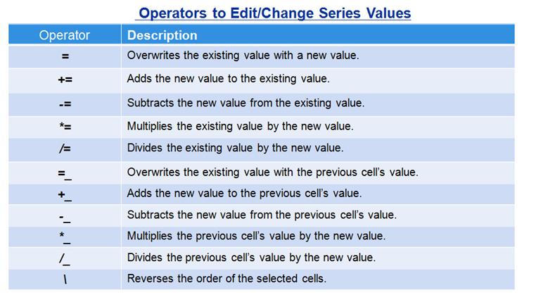
As described in the lecture, editing a series in EViews is easy. Open any series and click on the Edit +/- tab to turn on “editing mode”. This allows you to add data to the series or change existing values in the series.
Similar to Excel, you can fill in data manually using the operators shown below:
Interpolating a Value
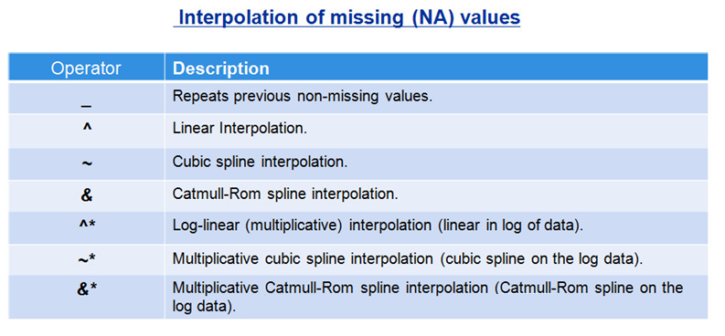
Better yet, let’s have EViews interpolate the data using any one of the built in interpolation procedures. EViews has special symbols for various interpolation techniques, some of wich were discussed in the previous session:
Adjusting a Series
One useful EViews tool not discussed in the previous session is the so-called Adjust mode. Series Adjust mode allows you to compare data in the original series to any changes you may make. Unlike in Edit mode, the changes in Adjust mode are not permanent and can be easily reversed.
Click on the Adjust +/- button in the Series toolbar. EViews will add additional columns to the spreadsheet view: an “Unadjusted” column containing data before any adjustment, one column that detects the change in the new value from the unadjusted data (before you entered Adjust mode), and one that detects the percentage difference.
Sample
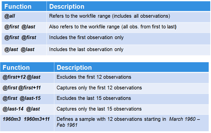
the user can change the sample under consideration using “smpl” statements. There are a number of useful @ functions to help you define the active sample more easily. Some examples of such @functions , as well as a description of the statements, are listed in the chart below:
create an equation in EViews
Select Object → New Object from the main menu and choose Equation.
Highlight the series you wish to estimate the equation with, right-click and select “Open” and then “as Equation…”.
On the command window, using the equation command.
Using the Quick menu and selecting Estimate Equation.
auto series,
which will be useful in forthcoming sessions on equation objects and regression. Auto series allow the user to create functions of series “on the fly” and can be useful in keeping your workfile parsimonious (i.e., to not have too many series objects).
EViews allows you to work with expressions (functions of existing series) directly, without having to create and save new series.
Using Auto Series in EViews
Previously, we created new series for The Bahamas and Jamaica based on the log difference of their real GDPs. We could have instead used an auto series, namely: show d(log(bah_rgdp)). Auto series are quite useful in regressions (which we will touch on here, but discuss further down the road).
Let’s use auto series to examine the relationship between inflation in Jamaica and The Bahamas. Select both bah_cpi_eop and jam_cpi_eop (Use the Ctrl key to select both) and double click to Open equation.
In the equation window, transform both cpi variables using the log difference. Under Estimation settings, select LS for regression type and include the whole sample period, 1980 2014. Click OK.
the following statements are true about equation objects? Select all that apply:
The equation object is a single equation estimation object. The equation object contains more than one series/variable. Like a group object, the equation object is a collection of series objects, which depicts relationships between series. Opening an equation object will reveal the most recent results of the estimation.
the following are ways in which to create an equation in EViews? Select all that apply:
Select Object → New Object from the main menu and choose Equation. Highlight the series you wish to estimate the equation with, right-click and select “Open” and then “as Equation…”. On the command window, using the equation command. Using the Quick menu and selecting Estimate Equation.
What three things do you need to specify in the Equation dialogue box?
The equation specification. The estimation method. The sample.
Session 2: Equation Object: The Internal Representation of an Equation in EViews
The Equation Object: Working with Equations
Open up your Caribbean workfile. As you probably know, the inflation rate for a specific period can be calculated using the percent change in the CPI. Let’s create a new series that calculates the period-on-period change in the CPI.
For example, in the case of Jamaica, create a new variable called jam_infl = (jam_cpi_eop-jam_cpi_eop(-1))/jam_cpi_eop(-1), using the Genr function, which is found on the top of the default EViews menu.
Recall that the notation “(-1)” in EViews means the previous period (or first “lag”).
Inflation & Unemployment in Atlantis
Let’s now estimate a regression equation using an inflation series with a new (fictional) country called Atlantis. Import the data for Atlantis from the Caribbean Excel file, We will use the “atl_infl” variable to estimate a Phillips curve.
As you know, the Philips Curve refers to the historical relationship between unemployment and inflation in an economy. The relationship is typically negative; that is, on average, higher unemployment rates have (historically at least) been associated with lower rates of inflation.
From the main menu, select Quick→Estimate Equation, and click OK. The equation box will now appear.
In the Equation specification box, type atl_infl c atl_unemp_rate, where the first term, namely atl_infl, is the dependent variable, c is the constant (a vector of ones), and atl_unemp_rate is the independent variable.
Session 3: Equation Object: Allowing for Additional Variables, Including Dynamics
LR = SR/(1- beta_L(rdp))
The Equation Object: Analyzing Results of Equation Outputs
Let’s examine the output from our estimated regression in greater depth. Consider the output below:

As explained in the previous sessions, Panel 1 provides data on the regression inputs; Panel 2 provides the estimated coefficients together with some statistics that enable you to determine their significance, while Panel 3 provides summary statistics for the estimated regression.
For Panel 1:

For Panel 2:
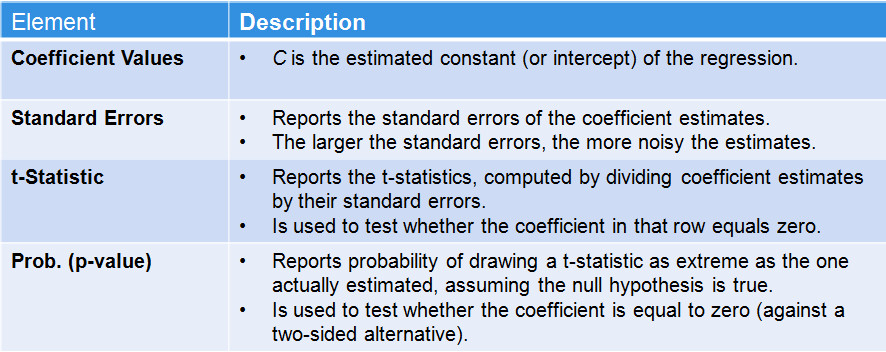
For Panel 3:
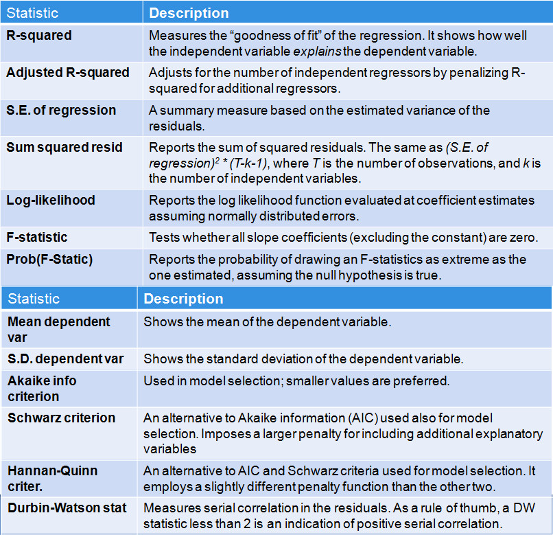
The R² of this simple regression explains about a fifth of the variance in the inflation rate. Other variables could be added to increase the explanatory power.
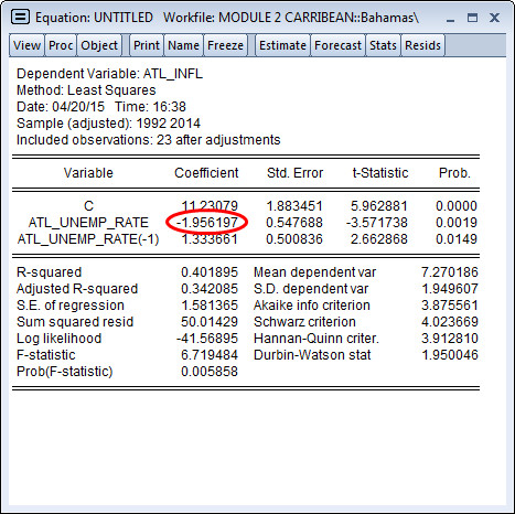
The coefficient on this period’s unemployment rate falls to -1.9561. This implies that a 1% increase in unemployment is associated with about a 2% decrease in inflation (on average). Note that the coefficient on the lagged unemployment rate is positive and significant. Including it in the regression helps better specify the coefficient on current unemployment.
As shown in the explanation to Question 2.42, the Durbin Watson statistic of the regression was 1.95. As a rule of thumb, a DW statistic substantially lower than 2 is generally a sign of positive autocorrelation.
You can easily look for autocorrelation in the residuals of an estimation using various methods. What are some ways in which to investigate serial correlation? Select all that apply:
-
Use Proc→Make Residual Series to capture the residuals of the most recent regression and save them as a new series.
-
After running your regression, select View→Actual, Fitted Residual→Actual, Fitted Residual Table or Actual, Fitted Residual Graph, click Freeze and then click Name to save this table or graph.
-
After running your regression, select View→Residual Diagnostics→ Serial Correlation LM test, and look to see whether or not the null can be rejected.
After running a regression, you can examine the fitted residuals by making a new residual series or viewing the residual series in a table or graph. Note that the residuals will represent the difference between the actual values of the dependent variable and the fitted value created by your regression for each period.
While the resid series will show the residuals post-regression, note that this series changes with your most recent estimation. Thus, it is advisable to use Proc→Make Residual Series to save the residuals of particular regressions (for future testing, for instance).
Formally, a failure to reject the null hypothesis of no autocorrelation in a serial correlation LM test also suggest that the residuals are not serially correlated. Finally, a Durbin-Watson statistic less than 2 suggests some residual correlation (although it’s important to use residual diagnostics to formally test whether this correlation is significant). However, a DW statistic less than 1 is strong evidence of positive autocorrelation.
Spotting Autocorrelation
To investigate, examine the residuals of the regression by selecting View → Actual, Fitted, Residual → Graph. Note that because the DW statistic is close to 2 in this case, the serial correlation, if it exists, will be difficult to see.
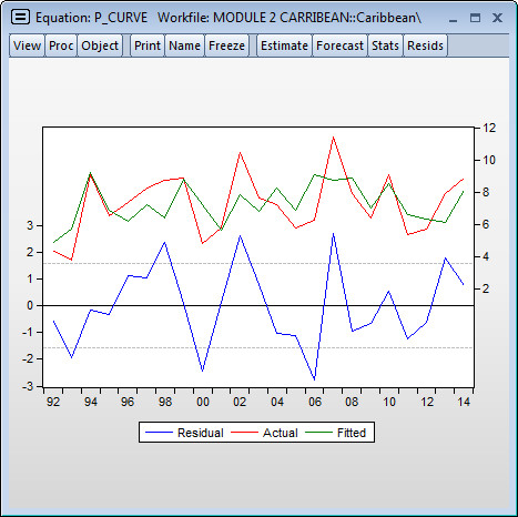
Looking at the graph, it’s not evident in which period is responsible for causing the DW statistic to be less than 2. Thus, including a dummy variable (as done in the previous session) is unlikely deal with the issue.
Adding Dynamics
Let’s try adding the a lag of the dependent variable to the right-hand side. Note that this will create a dynamic equation, leading to specific issues about how to generate forecasts from the equation. Do we, for example, use the forecast value of the lag to predict the current level of inflation or do we use (assuming it is available) the observed value in the previous period.
But let’s first see if the past period’s inflation can help explain inflation in the current period. Estimate a multiple term regression including the lagged dependent variable (inflation) for Atlantis.
No, the lagged dependent variable is insignificant and its inclusion actually causes the DW statistic to decrease marginally to 1.87.
Formal Residual Test: Serial Correlation LM Test
The DW statistic is not always a reliable statistic for testing the null hypothsis of no autocorrelation in the residuals, especially if you have a lagged dependent variable in the fitted regression. A more general alternative is to test for the absence of residual autocorrelation using the Breusch-Godfrey LM test.
Let’s run the LM test on a model that includes a constant, the unemployment rate, lagged unemployment, and lagged inflation for Atlantis.
As performed in the lecture, estimate your regression, then select View → Residual Diagnostics → Serial Correlation LM Test. Make sure you allow for 3 lags in the computation of the statistic.
The null hypothesis of the Breusch Godfrey is no serial correlation. Running the test with 3 lags, yields the following results.

Session 4: Basic Forecasting Using the Equation Object, Part 1
A within sample forecast utilizes a subset of the available data to forecast values outside of the estimation period and compare them to the corresponding known or actual outcomes. This is done to assess the ability of the model to forecast known values. For example, a within sample forecast from 1980 to 2015 might use data from 1980 to 2012 to estimate the model. Using this model, the forecaster would then predict values for 2013-2015 and compare the forecasted values to the actual known values.
An out of sample forecast instead uses all available data in the sample to estimate a models. For the previous example, estimation would be performed over 1980-2015, and the forecast(s) would commence in 2016.
As opposed to a static forecast, which always uses the known (and hence error-free) value of data to forecast the next period’s value, a dynamic forecast uses the forecasted value of the dependent variable to generate the next predicted value (and predicted values further out in the forecating horizion). As there will typically be an error associated with each forecast, errors will most likely accumulate (or build on themselves) as the forecast horizon increases.
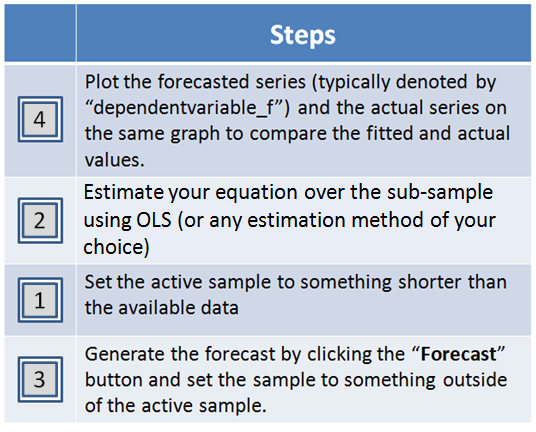
The first step is to restrict the active sample. Next, estimate your equation. Third, generate the forecast and while setting the sample to be outside of the active sample. Last, compare the actual and fitted residuals.
As explained in the lecture, the model simulator is a generalized forecasting tool that can deal with models with many equations. The values obtained from the model simulator for 2012-14 (atl_infl_0) are the same as those obtained using the Forecast tab (atl_infl_od). This should come as no surprise as the EViews simulator is solving the same equation that we used to forecast in previous questions.
create alternative scenarios using EViews. A scenario in EViews is a (dynamic or static) forecast conditional on a specific set of assumptions regarding the exogenous variables in the model. Obviously, the baseline forecast is an example of one scenario. EViews allows you to define any number of scenarios.
Module 3A: Statistical Properties of Time Series Data > Introduction to Time Series Data > Session
If z has a downward trend, then its mean is changing (actually declining) over time. This implies that it is nonstationary.

As time increases, all the pdfs shown in the graph (there is one for each period t) appear to be centered at zero. Therefore the mean of Y does not change. However, the dispersion around zero increases with t, since the pdfs become flatter as time t increases (that is, a smaller number of observations are close to the zero mean). Thus, the mean remains constant over time but the variance increases.
Because observed time series are actually finite draws from infinite stochastic processes, there is always a chance that you may never correctly identify the true stochastic process. What the methods and tools discussed in this module will allow is for you to come up with an educated guess of what the stochastic process is, which will in turn allow you to produce a reasonable forecast for the time series being analyzed. However, in some cases it may boil down to judgment, as there might not exist an unambiguously “best” model.
Identification of Time Series Data

This process can be characterized as an ARMA(2,1) as it includes 2 lags of the dependent variable and 1 lag of the disturbance term.
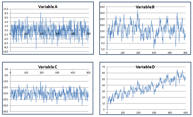
Graph A is inconsistent with the ARMA(2,1) model in Question 3.4 because it is centered around zero. Graph C is incompatible because the time series plotted in C has only negative values (the ARMA(2,1) model has a zero initial value and positive coefficients on lagged y’s and disturbances). Note that Graph D has an upward trend, which is again inconsistent with the stationary ARMA(2,1) process specified in Q3.4.
As long as there is nonzero correlation between y and any of its lags, y cannot be white noise. However, y can be either stationary or nonstationary, as we do not know whether the mean, variance, or covariance (correlations) change over time. Furthermore, with the given lag-one correlation of 0.65, we cannot determine if y is an MA(q) or ARMA(p,q). All three models can produce a correlation of 0.65 at the first lag.
An upward trend implies that the mean is changing over time, therefore y is nonstationary and all of the stationary processes (AR, ARMA, and white noise) can be eliminated.
Tools for Identification, Autocorrelation Function
the common pattern for an AR(1) such as Variable yar, whereas the opposite is true for an MA(1), that is, the ACF will drop off abruptly after lag 1 while the PACF will decay gradually.
the ACF of a pure AR(1) decays geometrically, and therefore the ACF at lag 1 is exactly the autoregressive coefficient (0.55), and at lag 2 is equal to the square of the autoregressive coefficient (0.552)^2 = 0.3025.
For one lag, the PAC is defined as the estimated coefficient b1 from the following regression:

For the theoretical AR(1) process defined above for Variable A, the estimated coefficient should be exactly equal to 0.55. We also know that the theoretical PAC of an AR(p) drops to zero after lag p. In this case, p 1, therefore the PAC at lag 2 should be equal to zero.
The regression output should appear as below:
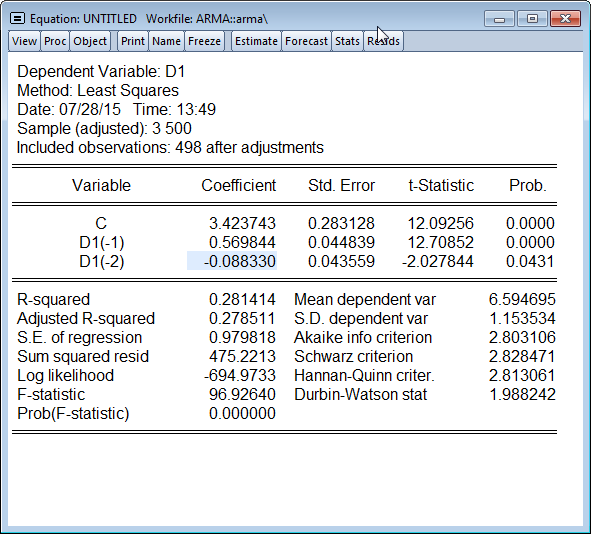
Estimating the PAC for one period amounts to regressing A on its 1-period lag, and taking the estimated coefficient on the lag as the PAC. For the 2-period lag PAC, you must regress A on its 1-period and 2-period lags, with the estimated coefficient on the 2-period lag being the PAC at two lags.
Note that the theoretical AR(1) should have a 2-period PAC of zero, whereas our simulated AR(1) has a 2-period PAC that is small but still statistically significant. This shows that even with a relatively large number of observations (500), a simulation of A does not necessarily replicate the behavior of the true stochastic process underlying it. A researcher looking at this time series (without knowing its true nature) might plausibly (but incorrectly!) infer that A is an AR(2).This example also suggests how difficult it can be to infer the true stochastic process from actual economic time series.
Session 4: Stationary Time Series: Estimation and Model Selection
Suppose you have estimated three MA models for a given series Z, and have obtained the following results:
MA(1): R2 = 0.852
MA(2): R2 = 0.854
MA(3): R2 = 0.855
Indicate which of the following could explain why the MA(3) is not the best model for Z (select all that apply): Although the MA(3) has the best fit, it does not have the lowest AIC. Not all of the three MA(3) coefficients are statistically significant.
EXPLANATION
Options a and b are correct and related; introducing additional terms into the regression will improve the fit (if only marginally), but these might not be statistically significant. The AIC weighs the improved fit with the additional parameters introduced, so it may actually be higher (i.e., worse) for MA(3) than for the other two specifications. If another of the two models has a lower AIC, then MA(3) cannot be the best. Also, there may be significant AR terms that could be included that lower AIC even further. Option c is incorrect; parsimony is not an objective on its own, otherwise, we would choose only AR(1) or MA(1) models.
Consider the following three models that have been estimated for pe_ind (the stock market price-earnings ratio in India).
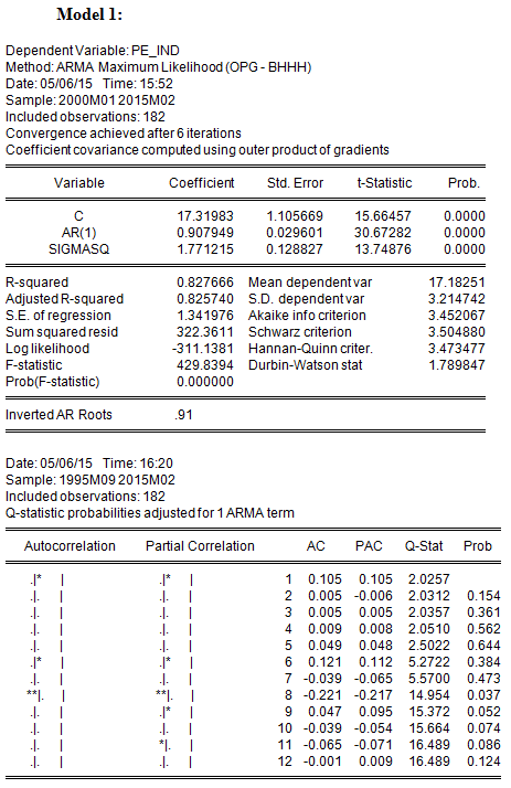
Model 1 is an AR(1);
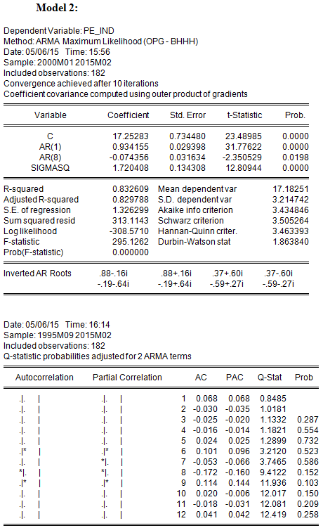
Model 2 has AR terms at lags 1 and 8 only;
Model 3 has AR terms at lags 1 and 8, and an MA term at lag 8.
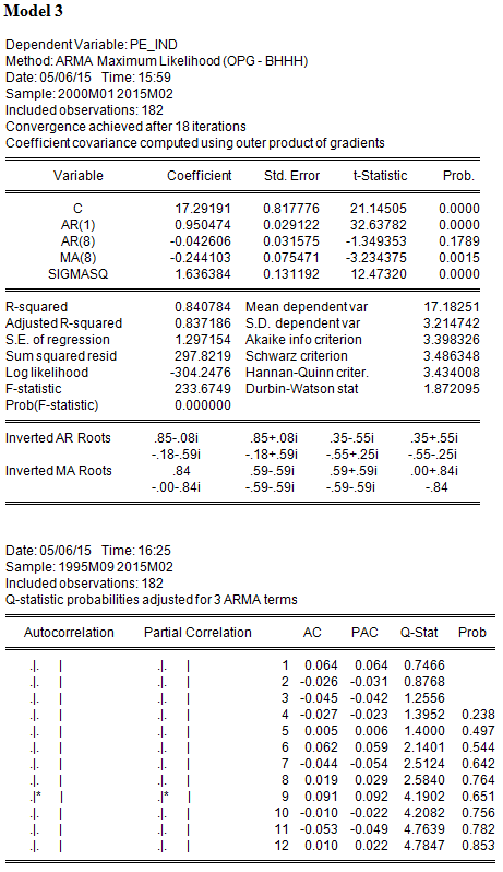
For each model, the regression results and the ACF, PACF and Q-Statistics for the residuals are shown below: Note: You are strongly encouraged to replicate the results yourself by using Quick->Estimate equation-> then typing in the equation pe_ind c ar(1) for example or running the command equation model1.ls pe_ind c ar(1) which will save the results in an equation object model1. Note that SIGMASQ which appears in the output if you are using EViews 9 is not the coefficient of an additional variable in the regression. It is the estimate of the error variance of the regression based on the Maximum Likelihood method. You can ignore it in the context of this module. Also note that if you use EViews 8, which uses a different default estimation method, SIGMASQ does not appear and the numerical results could be different.
Which model has the lowest Sum of Squared Residuals (SSR)?
In discussing the AIC and SBC in the lecture, we referred to SSR as the sum of squares of residuals, which reflects the goodness of fit of the regression. Model 3, with the highest number of estimated parameters, has the lowest SSR (297.8219) and, equivalently, the highest R2(0.840784)
Which model has the lowest Akaike Information Criterion (AIC)?
In addition to having the highest R2, Model 3 also has the lowest AIC; therefore the additional parameters are significant enough to lower AIC. Note, however, that the AR(8) term is not statistically significant.
Is the model with the lowest AIC also the one with the lowest Schwartz Criterion (SBC)?
Model 3 also has the lowest SBC (3.486348).
With which model or models can you be reasonably confident that the residuals are not serially correlated? (Select all that apply)
Note: to replicate the correlograms of the residuals you can either click on the regression window then View->Residual diagniostics->Correlogram – Q-statistics or run the command model1.correl(12) if you already defined the equation “model1” as show in the note above.
The null hypothesis of the Q-statistic is that there is no autocorrelation in the true residuals for all lags up to s. All of the reported Q-statistics for Models 2 and 3 are lower than the corresponding 10 percent critical value. (Equivalently, the reported p-values are greater than 10%.) Hence one fails to reject the null hypothesis that the residuals are not serially correlated. On the other hand, Model 1 rejects this null hypothesis using a 10 percent level of significance, but only after lag 7 (i.e., for lags 8-11).
Based on your reading of the results, what will you do now to determine the best model for pe_ind?
Although here we enter into the realm of judgment, it would be uncontroversial to say that Model 3 is better than the other two; it achieves lower AIC and SBC, and the residuals are well-behaved. However, it also noticeable that the AR term at lag 8 is not significant, therefore it is possible that the MA term at lag 8 is correcting for the autocorrelation observed in Model 1, and therefore the AR term at lag 8 might not be needed. Therefore, one additional specification that one might consider is an AR(1) with a single MA term at lag 8. It might achieve uncorrelated residuals with fewer parameters, and might lower AIC and SBC further. So our work is not quite done yet!
Session 5: Fitting a Box-Jenkins Model (Simulated Data)
If the regression residuals are white noise, then the null hypothesis of zero autocorrelation should not be be rejected. Assuming a 10 percent significance, the p-value for the Q-statistic should be greater than 0.10.
The true model, the AR(2) regression, has a lower AIC and SBC, exhibits significant coefficients for both lags, and serially uncorrelated residuals. Therefore, the diagnostics favor the true model.
Looking at the Model Selection Criteria table, one can see that the true model, AR(2) was one of the best in terms of AIC, but actually has the lowest Swartz Information Criteria SIC (BIC), as it is reported in the table). Therefore, using SIC (BIC) would lead one to choose the true model as the best.
Session 6: Working with Real World Data
The Best Model?
In the assessments for Session 5, we suggested that a model with an AR(1) and a single MA term at lag 8 might outperform the three models we had observed. Run this model, which we will call Model 4 (note that the Automatic ARIMA Modeling would not consider such a model, as it would include all lags up to lag 8 not just the 8th lag and no other MA term). The results for the previous models are summarized below:

Model 4 achieves serially uncorrelated residuals with only two estimated parameters, both of which are highly significant. Its AIC (3.396371) and SBC (3.466789) are lower than for any of the three previous models, and also lower than that of the ARMA(5,6) chosen by Automatic ARIMA Modeling.
Lesson: it might be possible to find a model that outperforms those chosen by Automatic ARIMA Modeling, by choosing more parsimonious models that include some higher-order lags but exclude intermediate lags. Automatic ARIMA Modeling is constrained to include all lags up to p or q.